

Notes: The Cost of Polluted Air
On thinking through mortality and air quality in India

Having recently returned to India after 4 years away, I have begun noticing many things about life here that previously seemed quite mundane (many of which have been succinctly captured by others who have written about their travels to the country, I particularly like Jason Zhao and Arjun Ramani’s). For example, I now clearly perceive India’s labour abundance, which has taken a tech-assisted shape of its own with “5-minute delivery” for virtually anything. Likewise, I am pleasantly surprised by the rising baseline level of trust in society that stems from the proliferation of the Unified Payments Interference (UPI)1 – it has digitized money in a very (and I cannot emphasize this enough), cash first culture.
Yet so much remains the same. Relentless, bad quality construction of public works leaves the roads perpetually dysfunctional.2 Our always overwhelmed judicial system is undergoing what appears to be an unstoppable breakdown.3 And perhaps, most consequentially, the air is poison.
Less than two centuries ago, many deaths fell under the umbrella of miasms: the notion that “bad” air was killing people4 through mysterious vapors rather than infectious viral and bacterial agents. This led to suboptimal methods of dealing with disease and caused an excess of deaths; yet today it might be relevant to re-evaluate the idea (especially in India) because the composition of the air, now a cocktail of pollutants, is increasingly making us sick.
Those living in the country know this and there is a barrage of headlines and social media posts documenting and complaining about the environment year in and year out. Yet, there is little initiative towards making things better and a defeatist attitude has become the status quo: why?
For one, I think it would be painful to the voting population if the government pulled and enforced policy levers on the causal factors of pollution. Quickly curbing our reliance on thermal energy, definitively phasing out old automotives to deal with vehicular emissions, or stringent enforcement of the crop residue burning ban will make things more expensive in the short run – it makes sense why there is a lack of political will to make real change. Therefore, as I contend, the first step to dealing with the problem is to get people on board and doing so requires good data5 – numbers that will help us forecast the human toll of air pollution and demonstrate the very real loss of life that chronic exposure produces.
Some health threats (those that are causal in nature) are relatively straightforward to quantify – for example we can reasonably trace malaria deaths and calculate lives saved through drug programs, vaccines, and mosquito nets. Air pollution mortality, however, presents a far more complex measurement challenge and accurate assessment requires multiple layers of reliable data: consistent air quality monitoring, particulate concentration values, comprehensive death registration, and detailed cause-of-death attribution. As I have recently discovered, India currently lacks robust systems for each of these components.
As the adage goes, “what gets measured gets managed.” Conversely, what is poorly measured is poorly managed – that is how we get downright hazardous air in India.
This may seem harsh, but for everyone with eyes to see (and a nose to breathe), it is a palpably true statement. One that becomes all the more striking as we barrel towards the colder, dryer months of the year, where large scale crop-burnings, combined with the lack of rain (which tends to “settle” particulate matter), leaves the country with a hazy smog that refuses to lift.6 This is only compounded by India’s continuous reliance on coal: per the PIB as of June 2025, thermal power accounts for 50.52% of India’s total installed energy capacity, with coal alone contributing over 91% of total thermal energy.
All these factors, when taken together, leave people in some of the most populous parts of the world with air that is unsuitable to breathe. However, because the monitoring infrastructure is woefully inadequate we fail to even measure just how bad things are.
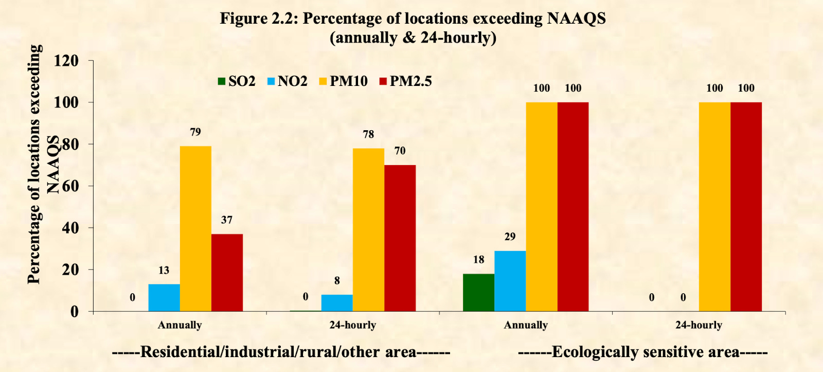
Note the difference in scale on the left and right hand y-axis respectively in the graph.

“Upon complying with the direction, India should operate 2312 monitoring stations covering approximately 502 cities across 26 states and five Union Territories (UTs). As of September 15, 2022, India possesses 1266 ambient air quality monitoring stations, which is approximately 54% of the actual target…NGT has directed that these monitoring stations will have to ensure the bare minimum requirement of operation. The degree to which Indian states and cities complied with this directive differs. Only 20 stations have been found to be complying with the direction, and 136 partially complied.”
We need good monitoring so that we can produce the composite standard measure: the Air Quality Index (AQI) which is a numerical scale that translates pollutant concentrations into a single number to communicate health risk. Different countries define the scale in their own ways, but as a general rule of thumb, it usually caps out at 500 and is broadly broken down into the following categories: Good (0-50), Satisfactory (51-100), Moderate (101-200), Poor (201-300), Very Poor (301-400), and Severe (401-500).7
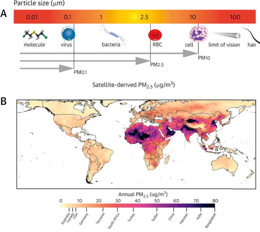
This aggregate number is calculated based on the concentration of several different types of particulate matter including PM2.5 and PM10 (which are measures of diameter in micrometers). PM2.5 is defined as fine inhalable particles that can reach deep within the lower respiratory tract because of their miniscule size. They can be composed of “inorganic elements, water soluble ions, elemental carbon, organic carbon, and [other] organic compounds” that can contribute to a host of health issues.
The World Health Organization updated its air quality guidelines in 2021, recommending that annual mean PM2.5 should not exceed 5 μg/m³ and the 24-hour mean should not exceed 15 μg/m³, while annual mean PM10 should not exceed 15 μg/m³ and 24-hour mean should not exceed 45 μg/m³. India’s standards however are far more lenient (most countries have their own standards which is a separate issue)8 and the limit for 24-hour mean PM2.5 concentrations is set to 60 μg/m³. This means India allows four times what the WHO guideline does over the same time frame.9 Even with such relaxed guidelines however, as the graph below demonstrates, the country still struggles with keeping pollution in check.
The second problem with accounting for pollution related deaths (besides the fact that we have issues with both the pollutant thresholds in use and with state capacity for measuring air quality) is that we are also bad at recording mortality. We don’t actually know with any precision what kills most Indians – and if we aren’t aware of what people are dying from, we will struggle with quantifying the real burden of air pollution.
For context, India runs civil (CRS) and sample (SRS) registration systems. CRS is an account of births and deaths, while the SRS is a more detailed demographic survey that is then regionally extrapolated to give whole population estimates. In theory, these two systems should roughly align, but this seldom holds true. For example, as Nandlal Mishra writes in Data for India:
“The level of suggested under-reporting in death registration by the CRS varies substantially from state to state, with only a fifth of deaths as estimated from the SRS registered in Manipur, for instance, in 2019. Among the major states Bihar reported the lowest level of death registration with every second death not registered with CRS. The level of under-reporting is also higher in rural areas and among women.”

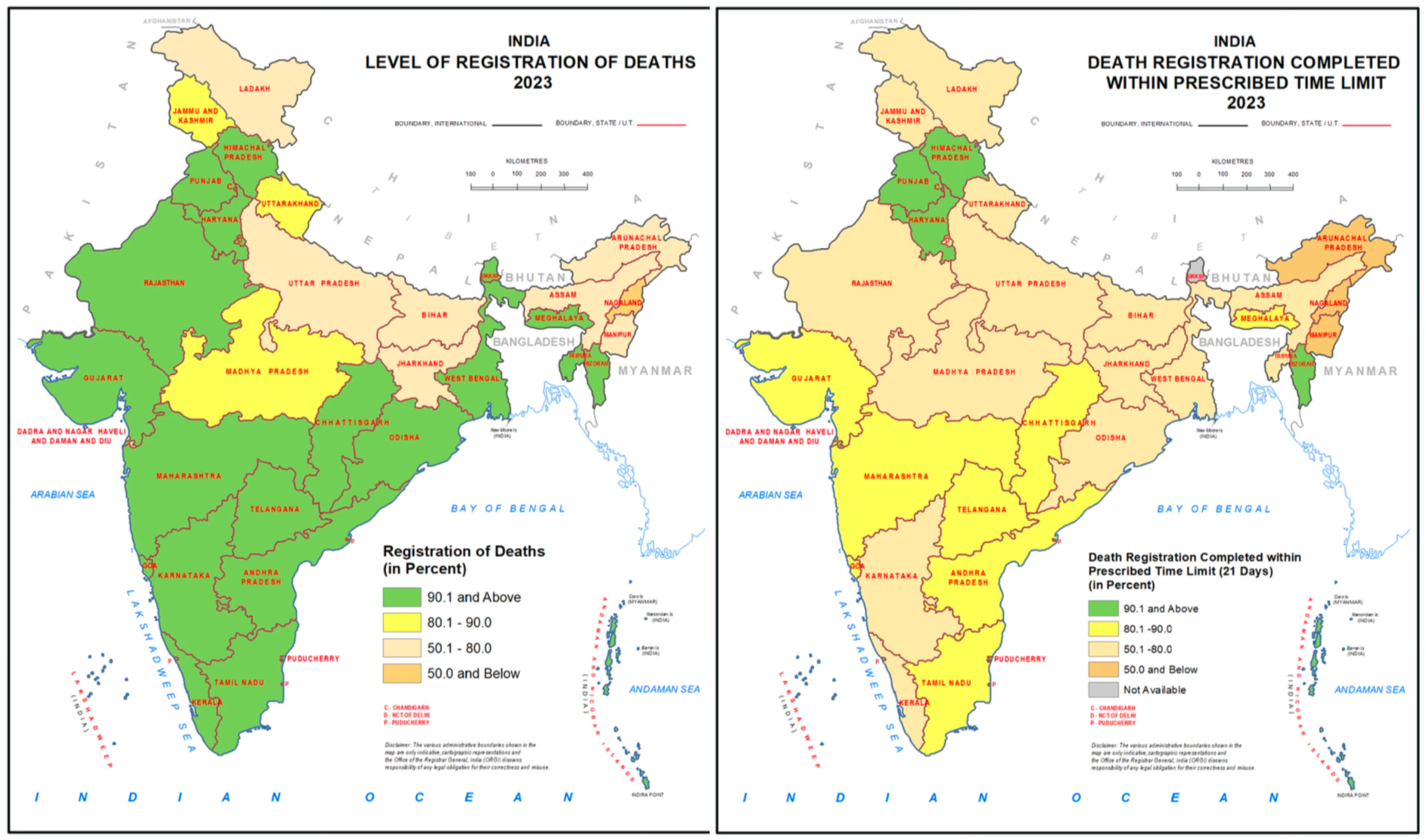
Clearly there are big gaps in the data but even if we decide to take the numbers from the CRS at face value, we are still left with incomplete information. The graphs below from the 2023 national report underscore the problem: not only is the data on death registration incomplete (left), even the information we do have arrives with such latency (right) that we almost certainly lose important details about cause of death.
Besides raw numbers we also need data on what people are dying from: is it a cardiac event or cancer? Was it an accident or the result of a long-term disease? However, per a cross sectional study from 2015, “The registration data were inadequate for a robust estimate of mortality at national level. A medically certified cause of death was only recorded for 16.8% deaths registered…On death reports, the columns for recording information on specific factors – e.g. pregnancy, smoking and alcohol use – were usually left empty. Even if such information was recorded on a death form, there was no space for it on the corresponding death register.”

I flag all of these problems because inaccurate and incomplete data seriously impedes our ability to understand air pollution deaths. Researchers estimate mortality from a given risk factor using what is called the “population-attributable fraction” (PAF), which tries to answer a specific counterfactual question: “suppose every member of a population who was not in the most favorable level of an exposure or some other condition or event with regard to an adverse outcome had been shifted into that level. By what proportion would the entire population’s rate, hazard, risk, prevalence, or caseload have been reduced?” In this discussion we could frame the question as such: if we could reduce everyone’s PM2.5 exposure to some target level (say, the WHO guideline of 5 μg/m³ annually) by what proportion would we reduce the total mortality rate in the population?
Answering this question requires a solid baseline of how many people are dying and from what. Nevertheless, the estimates that researchers have made don’t particularly invoke confidence.
The most widely cited estimates come from the Global Burden of Disease (GBD) study, which attempts to systematically assess mortality and disability from major diseases, injuries, and risk factors worldwide. For 2019, the GBD estimated that air pollution (both ambient and household) contributed to approximately 1.67 million (or 17.8% of all) deaths in India.
However, this figure requires careful interpretation. Unlike deaths from discrete events like car crashes or drowning, air pollution acts as one of multiple straws that can eventually break the threshold for disease. A person might be simultaneously exposed to air pollution, tobacco smoke, and occupational hazards, all contributing to their eventual death from cardiovascular disease or cancer. This means the same death could theoretically be prevented through multiple interventions – cleaner air, smoking cessation, or workplace safety improvements.
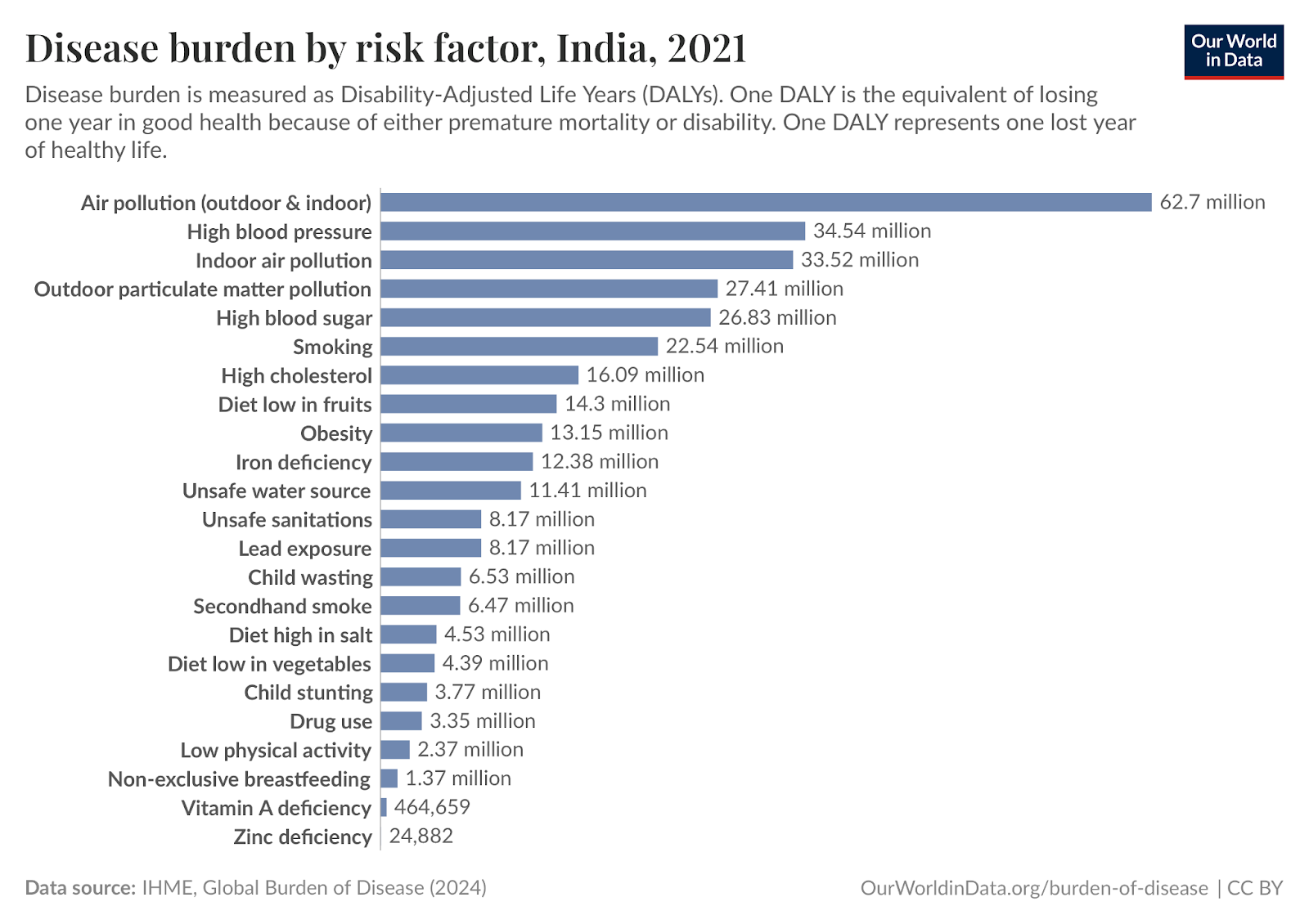
A better metric is found in DALYs (Disability-Adjusted Life Years), which capture not just premature death but also years lived with disability caused by air pollution exposure. For India, the burden is a staggering estimate of 62.7 million DALYs annually which shows just how badly persistent exposure to bad air can degrade quality of life for millions. Moreover, if the baseline data was better, we might be seeing worse numbers on the board – excess deaths and suffering, real loss of human life.10
This is a sorry state of affairs and an exceedingly difficult problem to solve, but we must not forget that there are things we can do to move the needle in the right direction. Doing so requires big policy wins such as reducing our dependence on coal for energy or cracking down on agricultural stubble burning, but it also needs people to truly care about the air they breathe – and that begins with better measurement.
With thanks to Abby ShalekBriski, Alexandra Danylysyzn, Grant Mulligan, Pranav Aggarwal, and Venkatesh Ranjan for feedback on drafts.
Cover Image: Camille Pissarro, Morning, An Overcast Day, Rouen, 1896, oil on canvas, The Metropolitan Museum of Art, New York, Public Domain.
Note: In an effort to hold myself to a higher standard, this blog will soon have an errata page. In the meantime, please comment or email me on hiyajain[at]substack[dot]com in case you see an error and I will respond/issue a correction (with attribution) as appropriate. Thank you for reading my work!
Full form: Unified Payments Interface [wiki article for context]
See some recent reporting on this: in The Hindu (for Tamil Nadu), Times of India (for Pune city), and this rather illuminating reddit thread
See: A 2021 report from the Carnegie Endowment and this excellent (and very recent) critique by Nicholas Decker, What’s the Matter with India?
From the Wiki: “the term malaria originates from Medieval Italian: mala aria ‘bad air’, a part of miasma theory.”
This is an objectively difficult as to make given reports that water being sprayed near monitoring stations to artificially bring down accurate measures of the ambient AQI.
As an anecdote: if I can open my windows without the indicator on my air purifier turning red and the fan whirring louder, then it is almost certainly because the filter is clogged and not because the air is actually breathable.
Now it is worth noting that theoretically the scale can exceed 500, but for most guidelines, it just stops making sense to create further bifurcations when the situation is so dire – this is one of the reasons why you may come across articles or independent 3rd party testing agencies providing numbers that exceed 500. Moreover the fact that we don’t have clear, homogenized guidelines on AQI is actually quite bad; it makes trusting the numbers from any source difficult and creates a situation where it is hard to develop good heuristics. For example, in the UK the local scale only runs from 1-10. This means that even if you weather app is providing an AQI for london that is 2 (because they pull from government stations), the air is actually not that good: The real-time AQI in London is typically between 30 and 60 on the US AQI scale or a low single-digit value on the UK’s Daily Air Quality Index (DAQI). Also note that the WHO guidelines (a detailed breakdown in the report here) are binary cut-offs while national AQI guidelines are ranges. This is a good illustration of a horrible problem. See this Wiki article for more on how confusing AQI can get.
See previous footnote (7).
Moreover: “The numbers are staggering. The World Health Organization says anything above 5 micrograms per cubic meter is unsafe. India sets its standard at 40 [note: both measures for annual average limit]—already eight times higher. Delhi’s average is 131. And in those weeks when the media shows apocalyptic images of the capital city, the air carries 400, 500 micrograms of these particles.” From The Plank.
A separate study in the Lancet [open access] that looks at PM2.5 deaths in India more granularly, they write: “First, the outcome data on age-specific and sex-specific mortality were not available, hence stratified analysis to identify vulnerable groups was not in the scope of this study.35 Second, completeness of death registration across the country varied, with some states having lower registration levels than others, and we addressed these differences in a sensitivity analysis, without notable deviations from our main results.35 Third, although the exposure model was available at a fine spatiotemporal scale, we had to aggregate the exposures at the district level to match the spatial scale of outcome data. We observed the differences in the estimated causal effect across the administrative divisions, which could be attributed to different sources of air pollution….Fourth, some of the covariates, such as population counts, literacy among women, use of clean cooking fuel, and population aged 60 years or older were not available at all timepoints, hence these variables were imputed either linearly or considered as constant. We acknowledge that we were unable to account for other pollutants, such as NO2 and O3, that could have provided a more complete picture to our analyses by isolating the effects of PM2·5 from other pollutants.”
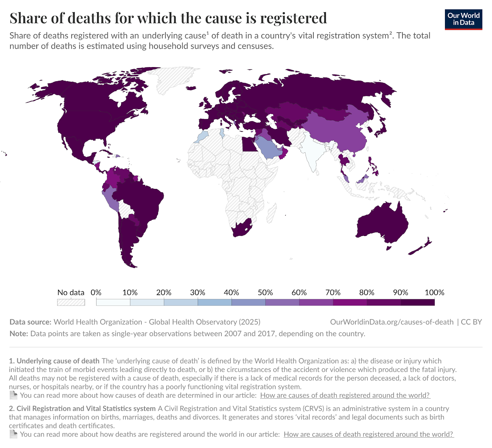
Sorry to get off-topic, but do you have any idea what is going on with the Sahel in this map?